A lot of art | April 2024
There’s a LOT of art going on, and some of the best is from the edges.
I saw heaps of shows that did things a bit differently in April, and this issue of Make and Do is something of a testament to that. Something I’m really wanting to do here is to point out there there’s always more happening than you might think – to show you that art itself has a lot more forms, that it crosses over with all kinds of other disciplines, and can exist somewhat like gorgeous fungi that you have to just find.
What attracts me to art that exists, or presents itself, in a different manner is that it creates a dialogue about how we might experience something. Or shows us that art can have a different purpose or outcome to what we might think. There’s an extent to which all three shows I’ve looked at this month do this kind of thing: they focus on things like ephemerality, access, process, collaboration and community, which is all kind of important right now. I don’t think art like this will necessarily "save the world", but it is art that is not about an end product, art that emerges from collaborative thinking and work, and art that presents a critique of The Market in some way (and all these shows manage to do that in varying ways).
Notes and things
Marian Zazeela died at the age of 83, and I really wanted to note her life and career because she’s a deeply significant artist whom people can miss. She was a pioneer of light art or light sculptures, and was probably one of the first to do this, if not the first; she was part of the Theatre of Eternal Music with her partner, the influential minimalist composer La Monte Young. They kept the Dream House installation of light and sound running in New York for something like five decades, and she was a very original designer, so here’s a look at some of her stunning posters . There’s a lot more to Marian, but her light works probably influenced Andy Warhol’s Exploding Plastic Inevitable that The Velvet Underground played at, and the VU in turn were influenced by minimalist composition – John Cale was at one stage part of the Theatre of Eternal Music. This puts Marian right near the origin of some of the 20th Centuries most pivotal culture, and so much would have been different without her visionary art.
Light and sound is a nice link to Matt Warren, a wonderful artist who works with those mediums. Matt has a new album coming out, over at room of silence – the album is called WAIT and you’ll have to do just that because it’s not out until the 3rd of May. But I snagged an advance copy and it’s a ripper selection of darkly glowing ambient tones and atmospherics. Matt makes great sound, and is always worth checking right out.
Alright, thanks for being here and do pass this around, pass comment and let us know what you reckon, if you have time (which no one does under Late Capitalism).
Hold fast.
Ceasefire now.
Free Gaza.
OUTLIERS 24
David Schwan, Sketch Kelly, Faheem Sumar, Junqi Austin Yang, Nigel Duckett, Anna Mykhalkchuk, Renate Hughes, Rosie Brennan, Laura D Tanner, Tomas Langley, Kjell Erskine, Lynn Avrillon, Sakina Parsa, Lisa Rime and René Rime
Moonah Arts Centre
15 March – April 6 2024
There’s a category of art that troubles me, and that is the art that is called ‘outsider’ art or ‘Art Brut’ in France, or ‘vernacular art’ or ‘folk art’ or something that indicates it comes from beyond the fence that circles Real Art. This is an awful analogy, not least because these terms often refer to art by ‘poor people’ or ‘untrained people’ or 'disabled people' or something similarly insulting or reductive. Still, there’s a point in all this: the art world, such as it exists, doesn’t make room for some people, and those people might in fact be producing really interesting art.
The people making said interesting art might have challenges of some kind, and they just can’t access the existing processes and systems, and they’re making art anyway, because that act of making is crucial in the first instance. There are people it doesn’t work for, and we’re missing out on seeing what they do; and it might be super interesting, and it might at the very least broaden out or notions of what we think art is. I think it’s a bit of a tight rope too, as we can end up fetishising this kind of art as being ‘raw’ or ‘real’ and that’s a problem as well; but it’s crucial to see this stuff and consider it all when we consider the broad spectrum of what art is, what it can be, and what it might do.
The Outliers Studio project is an attempt to provide a space and support for people who, for whatever reason, don’t fit elsewhere in the art ecology, and give them space to make and to be seen, and for that work to be experienced by the art audience, and for that audience to learn something from it. Let’s get this clear: I benefited in my work as an arts critic from seeing this work because about the most crucial thing that I need to do as an art critic is continually question my preconceptions about art. Art that makes me go ‘oh hang on’, or exposes me to something new, is crucial and valuable to me, and I give thanks for it.
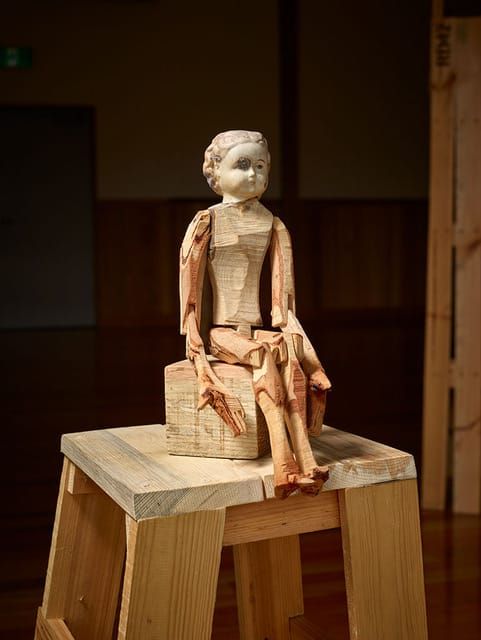
Outliers 24 grew out of a semi-regular studio project that gave a vary diverse group of people the opportunity to make art, and it culminated in an excellent show that contained a lot of art, some of which is impressive, and all of which was filled with expressive intent.
I am drawn to some artists more than others.
David Schwan is genuinely interesting because I kind of know the guy, and he’s been developing his own style and approach for a long time, and there’s an absolutely genuine investigation and productivity occurring, and as an artist he’s actually process driven in a totally personal way, and his art is doing something that holds my attention; there’s a formal process that has advanced and is now quite fascinating; he’s also sort of oddly funny, and a bit morbid and a bit disturbing. He’s approaching a weird surrealist region, basically, and his long slow arc has some strong intent.
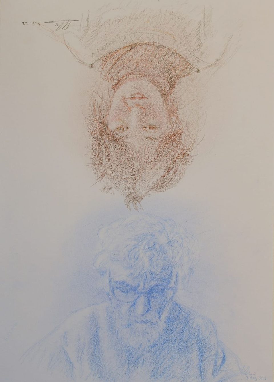
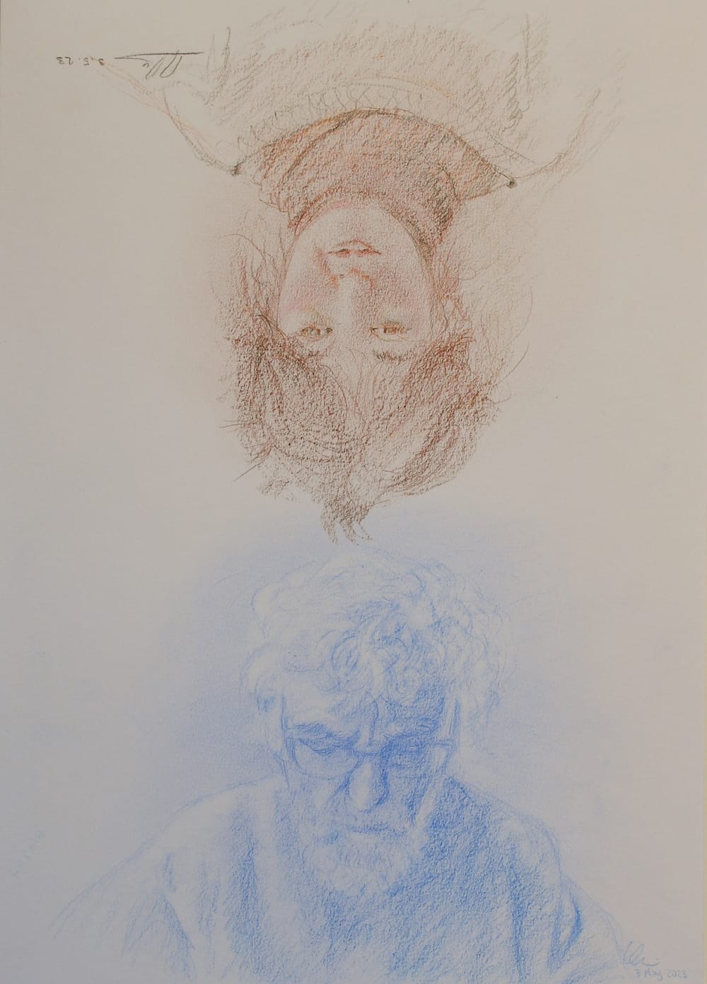
Lisa and René Rime are striking; they draw each other over and over again, producing a magnificent, diaristic body of work that is really striking. Both can draw, the output has an endearing fragility and beauty, and there’s something really sweetly beautiful about two members of a family just drawing one another again and again, suggesting a strong, important relationship that these drawings really celebrate. This collection, which I saw as one work that described time over a year, might be one of the strongest pieces in the show, and was beautifully presented not hung on a wall, but arranged on a table, that might even be the one Lisa and René sat opposite one another at, sketching with soft pencil.
Sketch Kelly's single work of images drawn on linen with texta is rough and enticing – there’s a wild narrative here that investigates the artist’s world and experience. Entitled Paranoid Psychosis/A Miracle/Near Death Trauma, the work sprawls and bleeds and has its own logic. Sketch Kelly lives transiently, and his output reflects his experience, mixing the rigours and challenges of day-to-day existence with a vivid, rich inner life. Formally it’s really wild stuff; the artist has his own way of working that’s well defined in its own parameters. There’s a density to the work that really carries it – Sketch really means it; there’s something really urgent and necessary about the expressiveness here. This is voice from a life removed indeed, and it’s notable and vital that Sketch Kelly’s art should be seen at all.
There’s a lot more here that I loved for varying reasons, but rather than explore the art more, I’ll direct you to the online catalogue which contains a lot more wonder to peruse.
Art like this needs to be seen, and the work required to bring it to the public is crucial work. Not everyone needs to like it or respond to it – no one needs to do that with any kind of art, really – but Outlier 24 really does prove that making expressive art isn’t just important for the people who make it, it’s important to the community.
Art isn’t a club, you don’t need special knowledge, you don’t need to know the jargon, you just need to do it.
At its very best, this show reminds me that there’s containment around art and how it gets seen that does exists, and that needs to be noted and questioned. This show does that; and yes, it is not for everyone, but I actually can’t think of any art that really is.
NIPALUNA AMBIENT STATION II
Richie Cyngler, Julia Drouhin, Elise Romaszko, Dylan Sheridan
March – April, Hobart CBD
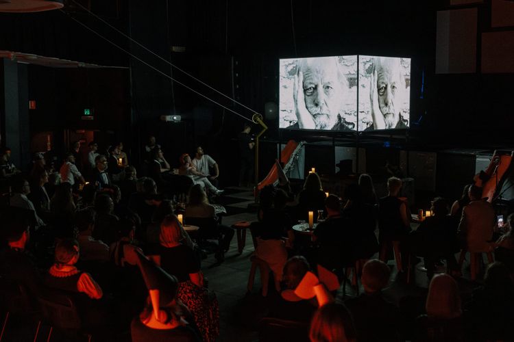
Gentle and ephemeral, Nipaluna Ambient Station was an interaction with some laneways and throughways in the inner blocks of Nipaluna/Hobart that was based forms of interactive and improvisational sound, music and text. The project featured a live performance and two installations, all of which were rather fetching interventions in spaces one usually walks through and barely notices.
I managed to attend the poetry and sound performance by Elise Romaszko, who read her works, scraped and touched a contact mic and generally inhabited a small laneway I never knew of next to the Maritime Museum. The readings apparently continued to drift in the space as recordings for the projects length, making for a pleasing disembodied habitation with little explanation, which is a fine way of doing things like this: art that that doesn’t contextually present as art.
The whole performance event was accompanied by lovely tinkering improvisation from Richie Cyngler and Julia Drouhin, and it veered from being charming to odd and back again over the course of the performance. This kind of event, that blurs lines between audience and performer, that ebbs and flows places itself well in nooks in cities, and reminded that there are always secret edges and cracks where something other than commerce might take place.
Richie also provided a genuinely beautiful sound installation that just dropped random sounds of a music-adjacent nature out of the air in Criterion Lane. This worked really well – I sat in the space for about half an hour and experienced the sounds blending in with people passing through. It felt like a special, tiny moment that was just for me – which it sort of was as I was the only person paying attention just then. This idea of a work that becomes briefly intimate in an urban space like this is quite potent, although equally important is the idea that this will end. It’s impermanent nature made the work pleasingly fragile; I had to simply experience the moment; there was nothing but the memory to remove.
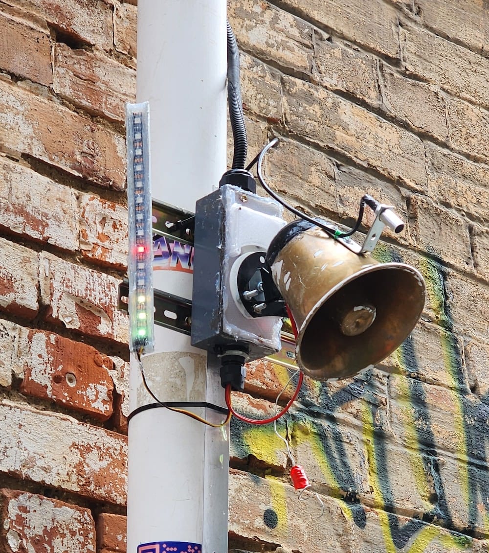
Dylan Sheridan’s work was a weird little horn/robot thing that moved in reaction to sounds. This was very typical of Dylan’s art – made from found and scavenged materials, but also the funny, feisty sculpture had the kind of attitude that makes Dylan’s art SO distinct. Dylan reminds me of the chaotic weirdness of early animation, and in particular the complex, distressing, surreal Warner Brothers cartoons that were a TV staple in my childhood. I am convinced that I learned the basics of existential dread from those cartoons; they often showed creatures stuck in repetitive roles, and everything was possibly alive and capable of movement. There’s an incredible scene in benchmark horror film Evil Dead 2 where every item of furniture in a room starts laughing hysterically and moving, mirroring a decaying mental state – it’s one of my favourite scenes in any film; it’s beyond weird and not what we expect, it’s funny, strange and somewhat intense – and it has the weirdness of early animation. Dylan’s art does this for me – it's innocuous and hilarious but it’s also – otherworldly, tinged with the uncanny.
Maybe that’s why it got vandalised. Maybe it actually frightened someone. It still sucks, because out of all the works it was probably the most gleefully bold and hilarious, and I feel Dylan’s art deserves a whole lot better – but the idea of someone attacking this thing also has a kind of downbeat pathos, because it really was doing no harm and was genuinely funny, sitting on a wall playing with anyone who would give it a go. Like everything Dylan does his small mobile horn exuded character, and this is something Dylan always has in spades. His work is distinct as you get, and he’s doing something that no one else around is even remotely. It’s a bummer this got smashed, but it was there for a moment, like everything in this charming project. I liked everything and I really want a third iteration. In terms of interventions in urban spaces, this is just a super successful project.
More detail is found here, and I suggest you could follow Richie on Instagram to see what he gets up to next.
SUPER ARTIST COLLIDER
Good Grief Studio
Alright, first bit: I made a wonderful error with this show. I thought there were no titles but there were and I missed them, (I have no idea how; they were written large on a wall but that’s my brain: somethings I just totally do not see).
This is useful but I can’t throw out that initial train of thought about how art is presented to us, about all the structures around art that we use and how necessary or not some of them may or may not be. I guess titles are necessary to some extent, and that these things are a part of making an art work, but there are loads of untitled works out there as well, and sure, names are fine.
But I was thinking more of the structure beyond ‘the title of a work’. I guess it’s useful to know how old a work is and what it’s made of, although a lot of the works here are what we call ‘mixed media’ and are not really built to last a hundred years. I guess that composition factor is useful for conservation, but again, that’s not all that important here – one of the things about Super Artist Collider was that it’s about moments and processes, symbolic and real. You had to be there, and this is going to annoy everyone that wasn’t but well, that’s art: it comes and it goes and there are moments and they don’t last.
What I will say is that I really liked this show, I really liked all the art, and I even managed to visit it more than once and spend time actually thinking on my feet about it, and its greater place in the fabric of local art. I will here give thanks for the existence of Good Grief, because shows like this, that are sort of scrappy and loose (these are good things) couldn’t exist anywhere else currently – which bothers me, but here we are. We have to work with what we have until something else comes along, or someone makes something happen. It’s the way: art spaces can only exist if they are nurtured, and the ones that function in the way Good Grief does are not built to last. Besides, it is the art that is important[1].
This art is art that was pretty important. For one thing, this was a very irreverent show. That’s really good in my world. I don’t want all art to be anything, but I do like comedy, satire, cheek, and a sense of play[2] in the art I see. That kind of tone ran all through this show, starting with the premise of ‘let us see what this pairing of artists comes up with’. The decisions were good, with the artists making something they may well not have otherwise, or providing a surprisingly good augmentation. Phillip Sulidae and Alicia King’s art was such a terrific fit I wondered why it had not occurred earlier – Alicia’s gorgeously weird sci-fi inflected work that looks to me like a mining operation taking place in the asteroid belt was given a mesmerising sound component by Phillip that made it all weirder and more prescient. King’s work in general has a foreboding critical element that suggests a range of possible futures where dynamic, massive natural forces come into conflict with things like human extractive greed, and Sulidae, who is simply one of the most intriguing local artists, has a weird parallel bent that uses sounds of real and imagined locations, or disturbing blurring of both notions. They are both good at being sort of unsettling and have a similar aesthetic that’s influenced by naturally occurring forms.
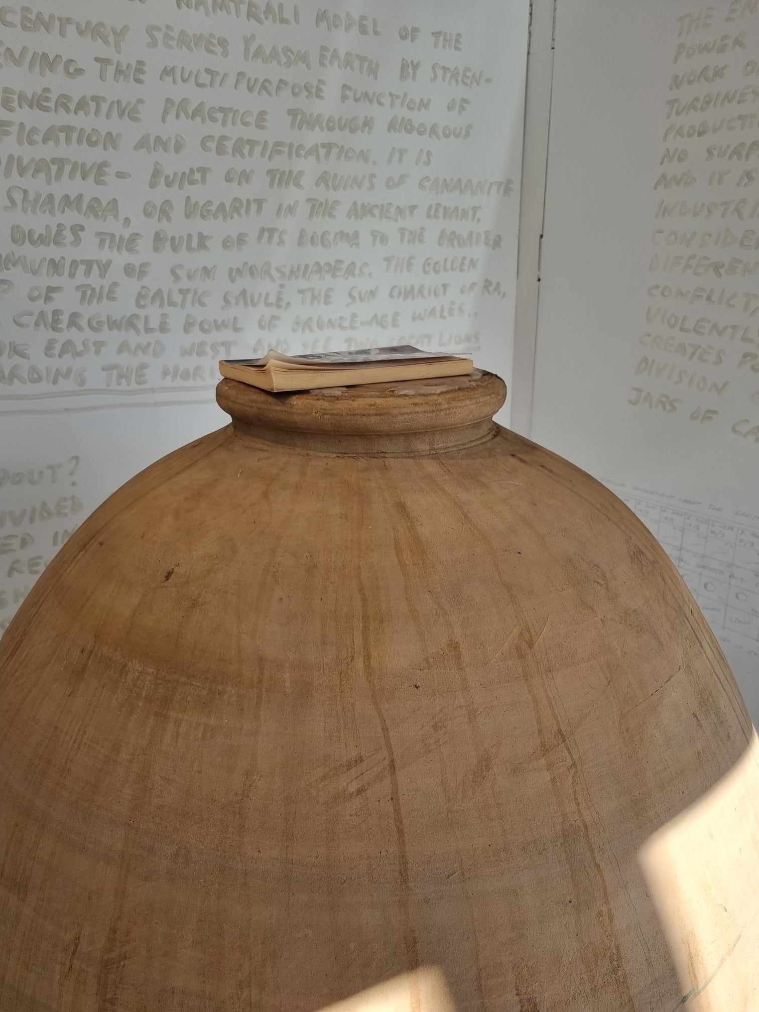
I was most gratified by Bobby K and Colin Langridge. Colin knows how to make decent sized vessel, Bobby knows how to make wine, they made wine in the gallery space, which I think was bottled or will be, and might get drunk later in the year. The vessels were cool, but the art was the collaborative process laid bare, and like the efforts of Sulidae and King, seemed to be commenting on capital and in particular the wine industry, which is exceptionally arcane: I don’t know why wine costs so much exactly, or why certain wines are attached to notions of status, or why the culture that exists around wine exists[3], but I was afforded a manifesto from 2021 from The People’s Wine Cooperative Ltd., that laid bare an ideological agenda of genuine proletariat rage about who gets to make wine and who it’s made for. It’s pretty direct, but the idea that something could ferment to fruition in a gallery space seemed like a decent, even hopeful analogy for creating change. Where change comes from is a very good question, and I have to enjoy any critique of corporate culture that is implied by simply making something oneself with available resources and skills. It’s pleasingly anarchic; it was also fleshed out with a bit of experimental treatment of the fermenting wine in some differing vessels – one was getting the Guantanamo Bay style flashing lights blared at it, which I’m guessing is an experiment to see if that wine turns out awful. This all spelled out neatly with another manifesto-style statement on the wall of the gallery, which I welcome; I think I really want to see the artist’s statement replaced entirely with strident, hopeful manifesto[4]s.
Silicone Valley, from Abbie Whitton and Chloe Catto actually cracked me up when I first saw it – it’s art that could have been made with me in mind, because it’s just so informed by that readymade spirit that I am a complete sucker for. Using what you have to hand and really stuffing around with its formal regulation is always going to thrill me. This installation work that consisted of a lot of repurposed material carefully raided from wrecks and skip bins really grabbed me: there was drain-exhaust conglomeration dangling from the roof that really looked like a tree root, sinister ducting, fans, tape-enclosed pipe fragments, an errant screen that showed cards that were visibly part of the show being balanced then a dog eating spaghetti (always a winner, is there anything intrinsically funnier than dogs eating pasta?). The work felt like it came together quickly and intuitively, and was a genuine collaborative outcome – I have no which person made what and it doesn’t really matter anyway. What we see is a chaotic self-regulating industrial refuge manifesto (again!) that suggests that art can emerge from any material if enough thought goes into it.
I could go on, but what I really enjoyed about this wasn’t so much the visual appeal of the work, although it all sat well together, it was more that the art had a strong DIY, re-use sensibility that wore its experimental ‘let’s see what goes down’ nature on its sleeve. This is the kind of work Good Grief is really championing, and it’s the kind of work we really need to see being made; stuff that’s kind of anti-branding, more about process than outcome – I can’t say enough about how much the laid-bare procedure of fermentation just exudes potential – and there’s no product, just work, ideas, effort, play and glorious accident. I loved this show; it’s just so great to see this approach to art.
[1] This is something I think about a lot; the nostalgic attachment to venues and spaces and how that can overshadow the content that occurred there. I understand immensely the importance of spaces: way back when, I used to run a film screening night called Hobart Underground. I managed to do it because I had free access to a space that allowed me to run a door, pay a sound guy, give some people a bit of money, at times pocket a bit of coin myself and not lose any money. The ownership of that space changed, they wanted me to pay a fee, and that was the end of it all. I did try and find other spaces but it never quite clicked. But I’ve screened films since and I keep finding spaces to have night here and there, and that will do, and it’s the content that is really important. Hobart Underground was fun; but it was also of its own moment, and that moment came and went.
I hope there is always an art space somewhere that does what Good Grief currently does, or at least something like it (each space has its own flavour, it must be noted), but if you spend too much time talking about how great that was, you might forget to build something new. It won’t be the same, but that’s important too. Things change and we all adapt.
[2] This kind of requires teasing out. When I say play I am meaning that yeah, I like a bit of fun, but it also means I like artists wondering, well, what happens when I place these two or three elements together and let them do their thing? I could say experimentation, and that happens as well, but there’s something important to me here that only really occurs when someone does something like draw black metal makeup on a bunch of head shots from a fashion magazine or covers something with electrical tape.
[3] Probably to do with Money or The Market or something.
[4] I found out Bobby K makes wine and you can, I think, buy it. You should also read about NAMTRAL certification, which is very interesting.
